Project
Developing Mountain Biking in Scotland
Overview
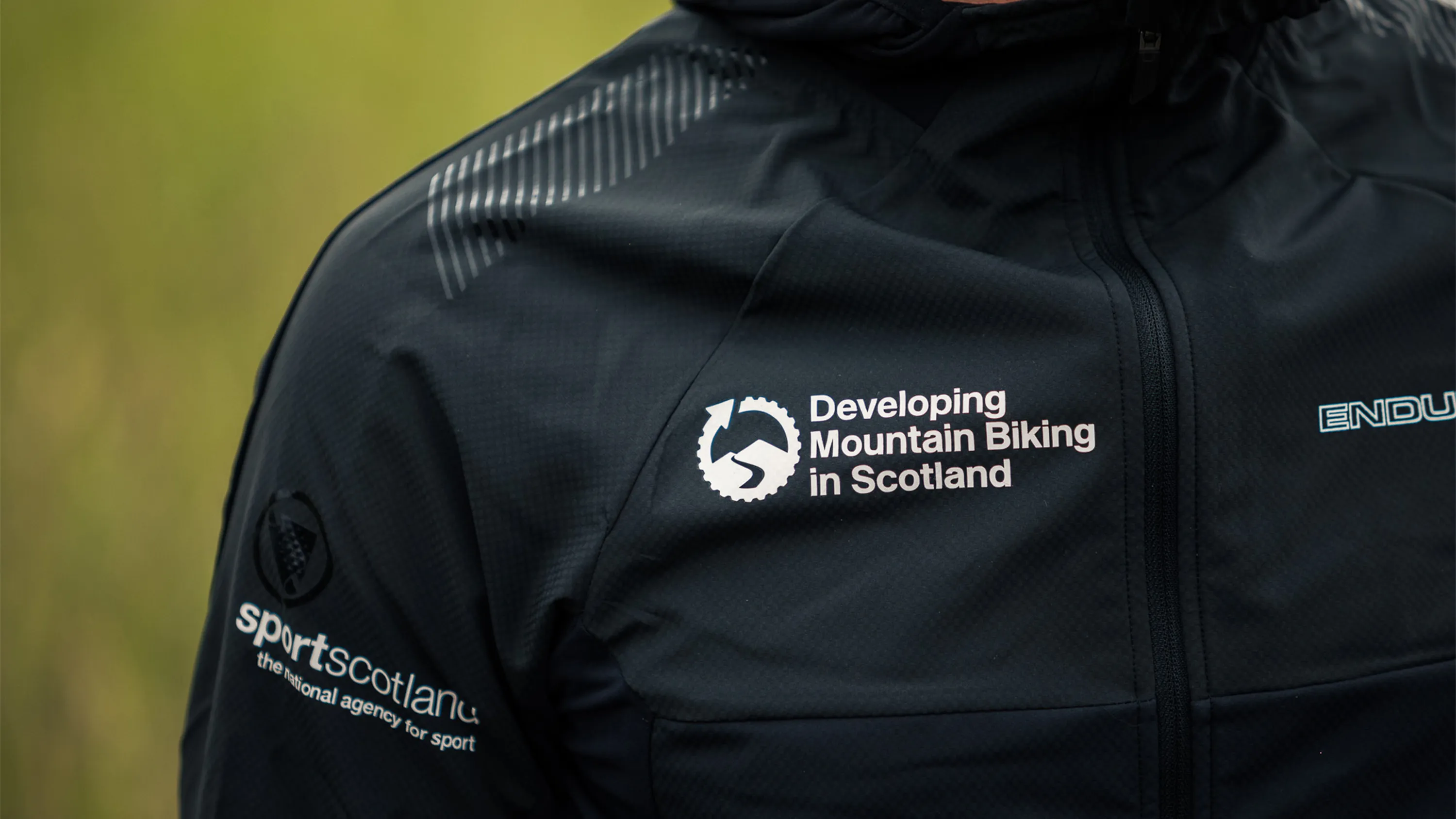
DMBinS is the body responsible for delivering the Scottish Mountain Bike Strategy; the organisation that exists to grow, protect, and advocate for mountain biking across Scotland.
When they came to Bough, they needed more than a refresh. They needed an identity that could carry the weight of that mission across every surface it touched.
Project Partners: Yep Digital, Web Development
Deliverables
Brand Design
Art Direction
Brand Development
Brand Guidelines
Brand Identity
Brand Strategy
Livery
Digital Design
Development & Management
Digital Strategy
Motion Graphics
Social Media
UI & UX Design
Web Design
Print Design
Marketing Collateral
The existing logo had one thing worth keeping: the arrow. It was already doing something directional and purposeful. The work was to build an identity around it that could scale, from trail signage and print to motion graphics and digital, without losing coherence.
Production Type’s Enduro typeface anchored the typographic system. The name earns its place here - Enduro is a discipline that rewards endurance and consistency over spectacle, which is exactly what DMBinS does for Scottish mountain biking. The usage was subsequently featured by Production Type on Fonts In Use, an independent typography archive.
The existing logo had one thing worth keeping: the arrow. It was already doing something directional and purposeful. The work was to build an identity around it that could scale, from trail signage and print to motion graphics and digital, without losing coherence.
Production Type’s Enduro typeface anchored the typographic system. The name earns its place here - Enduro is a discipline that rewards endurance and consistency over spectacle, which is exactly what DMBinS does for Scottish mountain biking. The usage was subsequently featured by Production Type on Fonts In Use, an independent typography archive.
The existing logo had one thing worth keeping: the arrow. It was already doing something directional and purposeful. The work was to build an identity around it that could scale, from trail signage and print to motion graphics and digital, without losing coherence.
Production Type’s Enduro typeface anchored the typographic system. The name earns its place here - Enduro is a discipline that rewards endurance and consistency over spectacle, which is exactly what DMBinS does for Scottish mountain biking. The usage was subsequently featured by Production Type on Fonts In Use, an independent typography archive.

↑
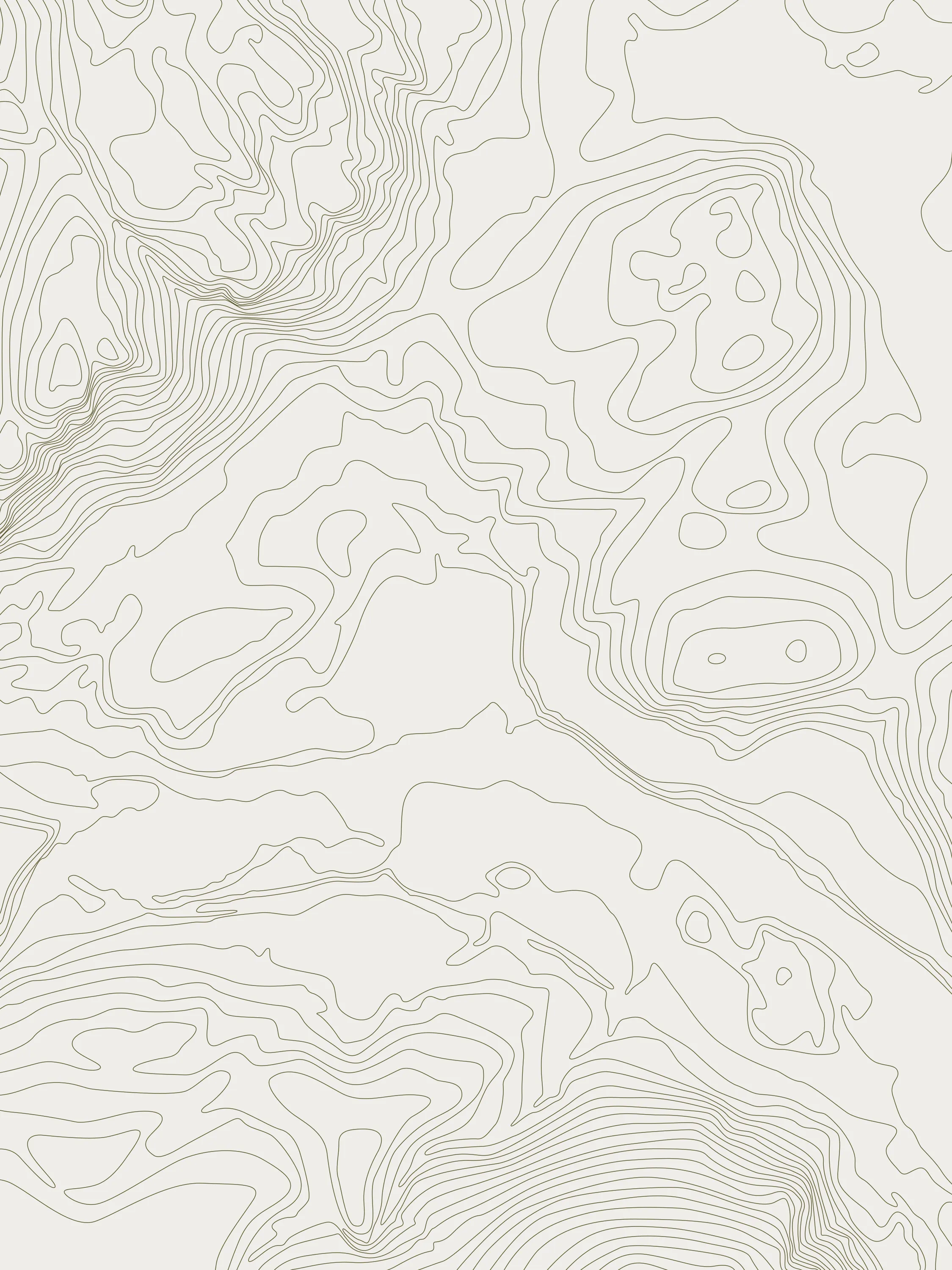
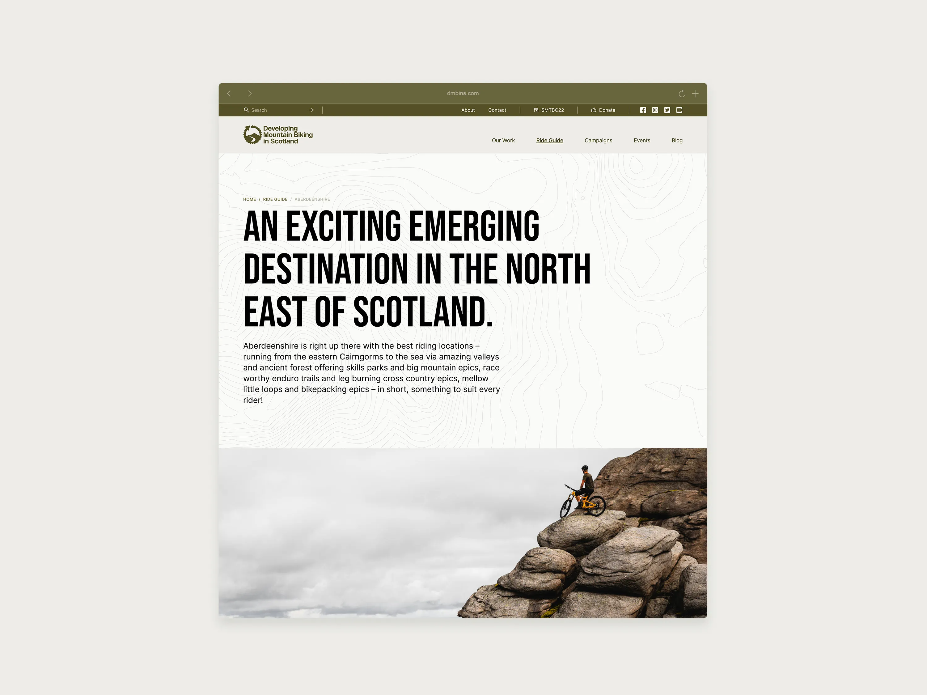
A series of contour graphics were produced for DMBinS's key destinations in Scotland.
↑
A series of contour graphics were produced for DMBinS's key destinations in Scotland.
↑
A series of contour graphics were produced for DMBinS's key destinations in Scotland.
One of the more distinctive pieces of the project was a series of contour graphics produced for DMBinS’s key riding destinations across Scotland: Tweed Valley, Fort William and Lochaber, Dumfries and Galloway, Perthshire, the Cairngorms, North Highlands, Aberdeenshire, Loch Lomond and the Trossachs, and Inverness and Loch Ness. Each graphic translates terrain into a visual mark that works as both a locator and a design element. Place made legible.
One of the more distinctive pieces of the project was a series of contour graphics produced for DMBinS’s key riding destinations across Scotland: Tweed Valley, Fort William and Lochaber, Dumfries and Galloway, Perthshire, the Cairngorms, North Highlands, Aberdeenshire, Loch Lomond and the Trossachs, and Inverness and Loch Ness. Each graphic translates terrain into a visual mark that works as both a locator and a design element. Place made legible.
One of the more distinctive pieces of the project was a series of contour graphics produced for DMBinS’s key riding destinations across Scotland: Tweed Valley, Fort William and Lochaber, Dumfries and Galloway, Perthshire, the Cairngorms, North Highlands, Aberdeenshire, Loch Lomond and the Trossachs, and Inverness and Loch Ness. Each graphic translates terrain into a visual mark that works as both a locator and a design element. Place made legible.
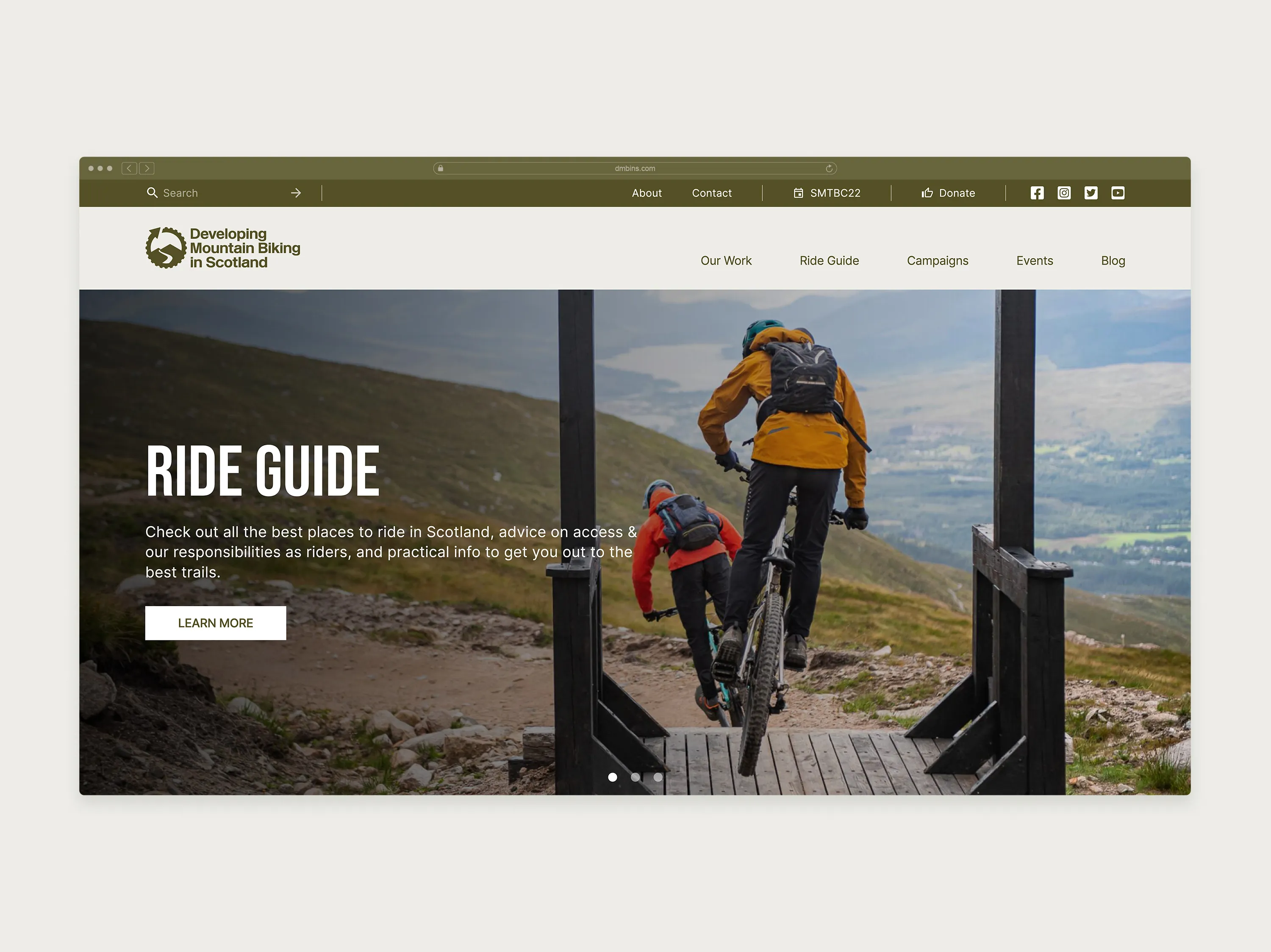
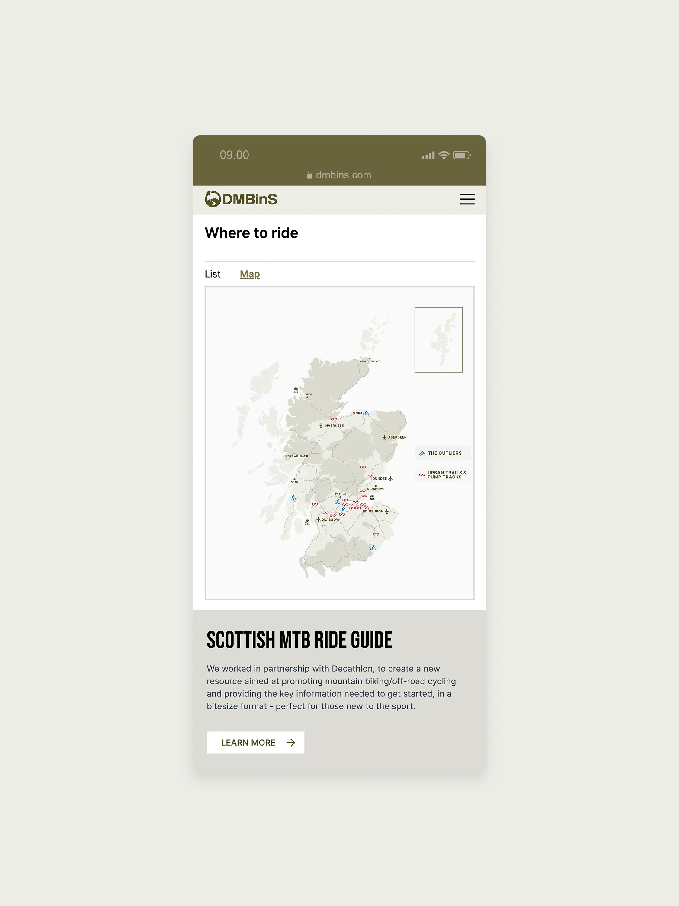
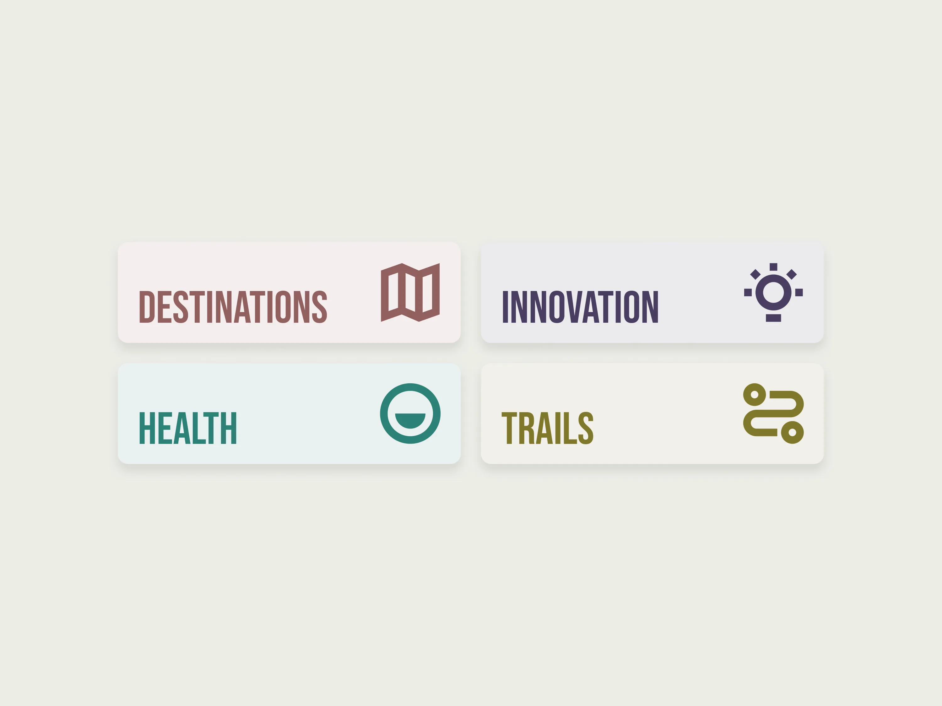
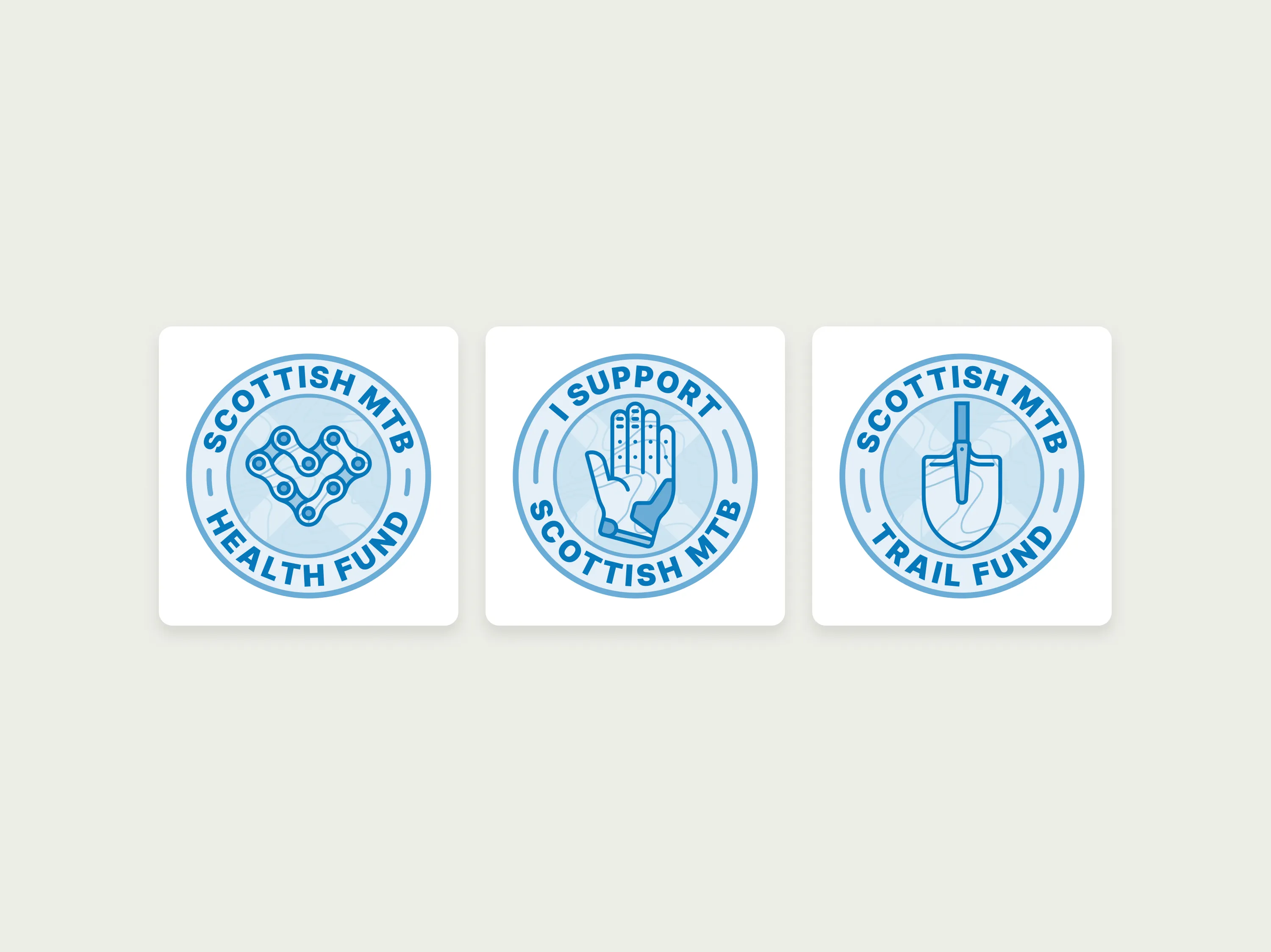
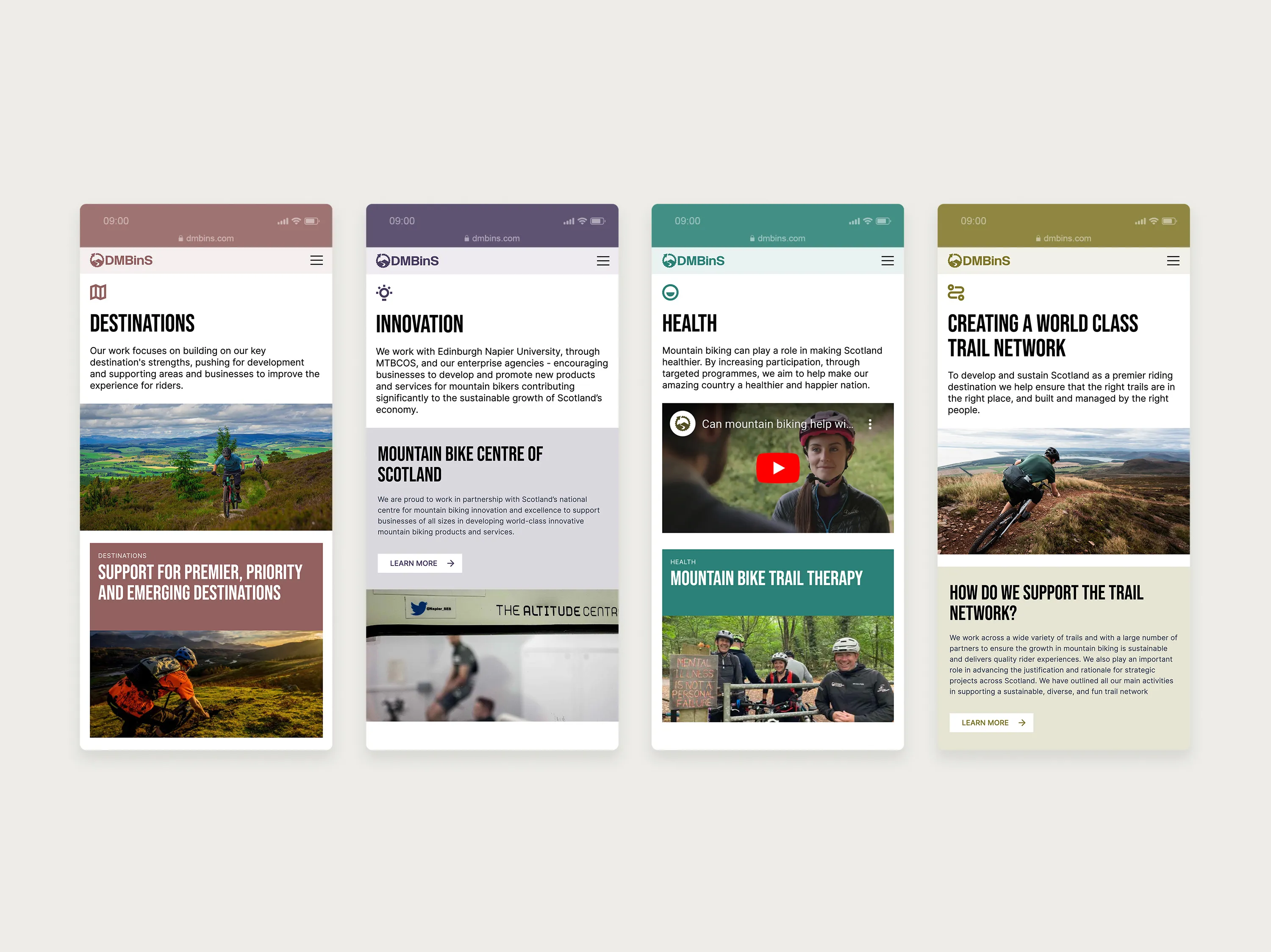
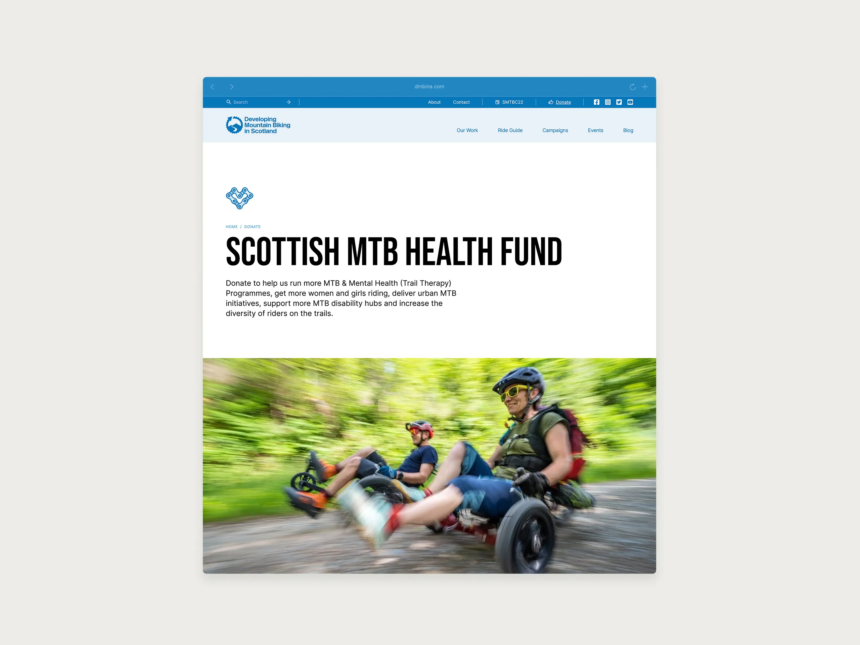
The website was built in partnership with Yep Digital, who handled development. The brief was to create a hub for Scotland’s mountain biking community, clear enough for newcomers and substantive enough for those already embedded in the sport. An interactive map lets users find ride guides by location. Colour and iconography identify DMBinS’s key programme pillars. Badges represent each charitable cause.
The website was built in partnership with Yep Digital, who handled development. The brief was to create a hub for Scotland’s mountain biking community, clear enough for newcomers and substantive enough for those already embedded in the sport. An interactive map lets users find ride guides by location. Colour and iconography identify DMBinS’s key programme pillars. Badges represent each charitable cause.
The website was built in partnership with Yep Digital, who handled development. The brief was to create a hub for Scotland’s mountain biking community, clear enough for newcomers and substantive enough for those already embedded in the sport. An interactive map lets users find ride guides by location. Colour and iconography identify DMBinS’s key programme pillars. Badges represent each charitable cause.
↑
Interactive map allowing users to select ride guides based on location.
↑
Colour and iconography used to identify key pillars of DMBinS.
↑
Badges were designed to represent each of DMBinS's charitable causes.
↑
Interactive map allowing users to select ride guides based on location.
↑
Badges were designed to represent each of DMBinS's charitable causes.
↑
Colour and iconography used to identify key pillars of DMBinS.
↑
Interactive map allowing users to select ride guides based on location.
↑
Colour and iconography used to identify key pillars of DMBinS.
↑
Badges were designed to represent each of DMBinS's charitable causes.
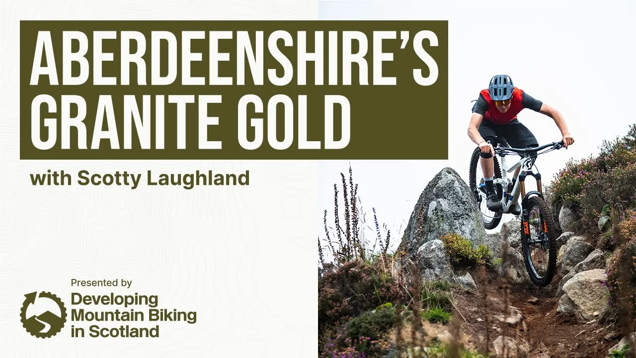
The motion work extended the identity into film, including Aberdeenshire’s Granite Gold with Scotty Laughland, produced for DMBinS’s campaign series. The brand needed to hold up on screen as well as it did on a trail sign or a jersey, and it did.
The motion work extended the identity into film, including Aberdeenshire’s Granite Gold with Scotty Laughland, produced for DMBinS’s campaign series. The brand needed to hold up on screen as well as it did on a trail sign or a jersey, and it did.
The motion work extended the identity into film, including Aberdeenshire’s Granite Gold with Scotty Laughland, produced for DMBinS’s campaign series. The brand needed to hold up on screen as well as it did on a trail sign or a jersey, and it did.


This was the full scope of what Bough does in a single project: strategy, identity, web, motion, and print. One thread, held together.
Results
Results
Data is based on analytics.
62%
More users visited the site
77%
More page views
108%
Increase in mobile usage
73%
Increase in social media acquisition